Show Gardens are definitely a fantastic source of inspiration when it comes to using colour in our gardens. For this month’s topic, Colour in the Garden, at Gardening Gone Wild’s Garden Bloggers’ Design Workshop I have decided to share some gardens/displays that have caught my eye!

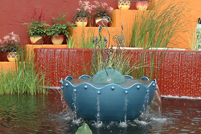
 Colour on walls can look striking as you can see above but I wonder how many ‘real’ gardeners are actually brave enough to do this. What I liked about the first garden above was the use of water with the strong colour. The pots also worked well especially the magnificent one used as a water feature. I liked the simple choice of plants with the bold design.
Colour on fencing and trellis well that’s a different matter and many of us will experiment with this. However, on saying that I was a tad nervous changing the dull brown on my trellis and arch to willow green! I am so glad I did though as it has looked bright on dull days. I quite like the use of two shades of the same colour for the fencing. The candles, well, I’m not sure about them but perhaps short chunky ones on a table – the colour once again catches the eye.
Colour in mulches – that one I am not keen on. The use of coloured recycled class is an interesting one but I would only ever go as far as a top dressing on a feature pot. But again it does blast a bit of colour and shows up the greens of the foliage very well. I like to see blue and green together.

 Colour reflections, now that is an interesting idea. The first garden above shows a mirror panel which, at the angle I took my photo, has people reflected in it. However, from another angle it would reflect the colour of the cushions as well as the planting.
Colour on cushions in the garden I do like! What a great way to really splash blasts of colour and patterns with the plants. This summer, if it is sunnier than last year, I plan to add cushions to my arbour. Perhaps I could get a colour match to the flowers of the verbena Bonariensis planted at the side of it. Mm… I like that idea. Mm… stripes, I fancy stripes for this year!
Colour panels now that too is an interesting idea! They could be interchangeable, reversible or even with patterns. I like the way the strong colour once again is seen with lots of green and simple planting.
Colour tapestries in planting now that for me is such a feast for the senses. I remember standing for some time just gazing at the beautiful layout and colours of the garden in the second photo above. I just loved the use of colour and material in the fencing and the colour of the freestanding cushions worked so well too. This garden had burst upon burst of colour but the overall effect was so calming. I loved it!

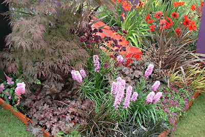
 Colour in foliage is being appreciated more and more now as being a very valuable source of colour in the garden. I just love foliage colours especially the deep purple/red hues shown above. Oh and the agapanthus just reminds me of why I love blue in the garden – it just so striking. I have already posted on blue in my garden.
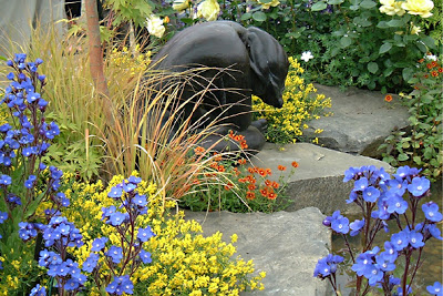
Colour contrasts I am not so keen on, but colour is a personal thing and I cannot deny that the display with the bronze statue above did catch my eye! I did like the use of strong stone hard landscaping in this case and it definitely helped to ground the colours.
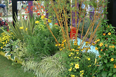 Colour echoes is a new term for me but I have been hearing it mentioned in many other garden blogs recently. I guess I would describe the planting above as blends of colour but echoes is a very good description. I like the way the colour is echoed through foliage as well as flower. Notice, there is more foliage colour than flower colour too – I like that.
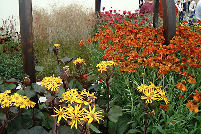
 Colour blasts – by that I mean you open your eyes to see a mass of one colour in one bold planting of the same plant shouting out at you. No interruptions just a pure blast to the eyes. Lovely, lovely! Now don’t grasses work magnificently with this kind of planting?
Colour bursts – by that I mean you open your eyes to see a panoramic view of plants then, every now and again, little bursts of colour just quietly dance in front of you. No shouting.
 Colour in nature, well that has to be the best kind to have in the garden! Bees, butterflies and birds can be seen as little bursts of colour in my garden – it just wouldn’t be the same without them! However, it is the greens in foliage, grass and hedging that blast through my whole garden. Ah… but there is one more blast of colour that I really enjoying seeing as I walk through my garden – a beautiful blue sky with fluffy clouds floating by! Ah… I am dreaming of summer now.
The photos above were taken at Garden Shows with the exception of the last one. To see more Colour in the Garden go the the link at the top and browse the comments.
Shirl your post is a dream. Such an enjoyable read on a rainy night. Lots of good ideas.
I really enjoyed this post. I think it’s because I like color. I also think adding color with items OTHER than plants is a great way to boost up the blasts & bursts.
You spent so much time putting this together. I enjoyed your thoughts on all the different ways to add color. I thought it was beautiful.
You’re never disappointed by the amazing array of articles and photos on your blog – the photos of these gardens are stunning and a true inspiration! I wish I had more time to spend on my blog but work has just taken over recently! Will visit again v. soon… Miranda
Hi again, Lisa, Jim, Anna and Miranda 🙂
Lisa – I am so glad you enjoyed it! I couldn’t decide how I wanted to post on colour until I searched out the photos and then it was easy, I rambled 😀
Jim – I’m glad, I really enjoyed doing posts like this one! I totally agree with you about adding colour outside plants – especially if it is movable! Then you can refesh the garden all through the season by moving things around. Gardening is never dull 😀
Anna – Thank-you! Once I finally decide the order of my photos I have great fun chatting about them 😀
Miranda – Gosh, thank-you! I have many photos of gardens and shows and I could never have predicted I would use them in ways like this. I do have fun with my blog and I only wish I could get more time to visit other blogs, especially ones who leave comments here. I visit them and find I have missed so much. I do try 😀
Shirl, I get most excited about the color of butterflies and birds too.
It’s snowing again and this post was like spring balm to me.
Shirl, I loved reading your post, thanks so much for letting me know about it. I have been busy lately and am not on the computer much and want to make the best use of the time spent here, and this was time well spent!
Frances at Faire Garden
This was a great post. It provided tons of ideas for me. I read in Horticulture Magazine an article they did on Picassos garden. Wow it was stunning and he used bold colors and painted walls and fences and it was great. I would be brave to do all those things are more. I love art and mixing art with gardening really packs a punch to the senses.
This was an interesting post – I am fascinated by colour and enjoyed reading the way you characterised colour in the garden. I love trying different combinations of colours and textures … I don’t think I’ll ever get tired of experimenting.
Boy, am I salivating now. I’ve never imagined having a garden like the ones you’ve showcased here. Just looking at them is a feast for the eyes. Thanks for sharing Shirl.
A very interesting comment on colour. Hardscape colour has crept into the English garden, yet we still seem to be uneasy with it, preferring the drifts of colour via plants. In this vein Dermot Gavin’s “Pod” 2 years ago at Chelsea, was stunning, bizarre, but stunning, whereas Chris Beardshaw’s garden based on Hidcote last year was gloriously rich in colour for the latter reason. My dying regret is never to have met Christopher Lloyd or managed to get to his Gt Dexter garden when he was alive. A great exponent of colour.
Colour, colour, colour…
I want my own house to begin with my dream garden!
You certainly gave us amazing pictures and ideas!
Just lovely! I want it all!!! 😉
What a lovely, interesting and most of all inspiring post Shirl! Thank you!
Wonderful, Shirl – thanks for pointing out that there are many ways we experience color in the garden. Your post makes me want to go outside and take notes in my own garden right now!
Annie at the Transplantable Rose
Hi again, Robin, Frances, Vanillalotus, Kate, Jayne, Border, Mel, Barbara and Annie 🙂
Robin – Yes, I can see that by the wonderful photos on your blog. I particularly like seeing the butterflies from your garden. I can well imagine how good a colour post would be to see when you have snow 😀
Frances – I am glad you enjoyed it. I managed some time to get a good look through your blog last night. I enjoyed your ’black’ themed colour posts for GGW. We also have a number of plants in common despite the miles! You have so many plants in your garden it was great reading about and seeing them 😀
Vanillalotus – Thank-you, it is great to be able to share ideas like this. I have never seen photos of Picasso’s garden but it sounds as wild as his art – I bet it would great to walk around. Ah… I must pop over to your blog soon and have a good browse through the colour you have there 😀
Kate – Thanks, we all see things differently. I enjoy reading other people’s spin on things too. Now, I am with you 100% on experimenting with colours and textures. I was out in the garden today doing a little planting and I am looking forward to seeing the outcome of this in the Spring 😀
Jayne – You are very welcome! That for me is the joy of the show gardens – they are experimental and have great impact. However they always have something that you can use in the scale of your own garden. The garden is a great place to be creative 😀
Border – Where do you start when writing about colour? I looked through my photos and then so many jumped out! After that I just chatted about my spin on them now. I hear what you are saying about the UK and interestingly all comments here, so far, are outside the UK with the exception of yourself. Yes the ‘Pod’ was bold as many of Gavin’s design are. I do think we are getting more experimental with design but yes colour is seen in quite a different light. Ah… colour and Christopher Llyod! Sorry to hear you didn’t meet him, we never saw him on our visit to Great Dixter but he was around as was a small camera team and an area was roped off. I only took a few photos and posted them at the beginning of this month. I have to say though, I do believe Sarah Raven has a similar eye for colour – but hey that’s just my spin 😀
Mel – Excellent! I hope you get it all 😀
Barbara – Thank-you! I found this post very interesting to do as it made me think of colour more myself. I am so glad I have taken so many garden photos over the years. I have so many more 😀
Annie – Thank-you, I am sure there are many more ways yet but it was my photos that drove this post. It has definitely made me get my ‘planning’ hat on too 😀
Beautiful, beautiful photos!
Wow yes, blasts of colours is the perfect title, they had similar setups at our local Southport Flower show and although I have to admit I dont know what I am actually looking at they are beautiful, as are your photos. Mike.
Gee, I thought I’d left a comment when I first visited, but I guess not. Well, I’ll say now that you’ve come up with some great insights here on out-of-the-ordinary ways to make great use of color in the garden, and seeing the examples from the show gardens was intriguing. Many thanks, Shirl!
What a stunning post, Shirl! Fantastic ideas and experiments. I’m with you–might not try some of these ideas, but i love the idea of them, and can see them working in other gardens. Wasn’t colour a great topic to use as we suffer our way through February?
Hi again Marie, Mike, Nan and Jodi 🙂
Marie – Thank-you! I’m glad you enjoyed them it was great fun chosing them 😀
Mike – Thank-you, yes the flower show exhibitors really do need to compete with colour in mind. Many times I am not familiar with a particular plant group and in some cases don’t like the flower at all – like fuchsias. But even in their displays I do stop and gaze and the flower colours as the displays have drawn me to them. Apologies to any fuchsia fans reading this 😀
Nan – Yes, I sat on the colour post as I had recently done white, and previously blue and silver. I’m glad I took my time as it would be a shame not to have shared these photos. You are very welcome! I was delighted to have taken part once again. Excellent round-up post. You mentioned posting a list for future months – I think that would be an excellent idea 😀
Jodi – Thank-you! That’s the thing about the garden isn’t it we want to be spoilt for ideas and inspiration then we can go which ever way the mood takes us. Yes, I agree colour was an excellent theme at for this month – especially for gardens like you in Nova Scotia where you aren’t seeing much of it at the moment 😀
Shirl- Your photographs were stunning and all of the garden designs/arrangements were very successful and well done because they were harmonious. The designer used either analogous colors or complimentary ones. And if you want to learn more about this, read my blog! 😉
Great post — I loved it!
Hi there Pam🙂
Thank-you! It’s always great to see a previous posting picked up again. I enjoyed that one 🙂
Thanks for the thumbs up on your posting – an excellent read with some stunning pics too 😀